
“The future will not be built by those who collect data, but by those who can interpret it meaningfully.â€
When you open a map app to check traffic, scroll through your shopping recommendations, or monitor your fitness tracker — you’re not just seeing data; you’re seeing the design of data.
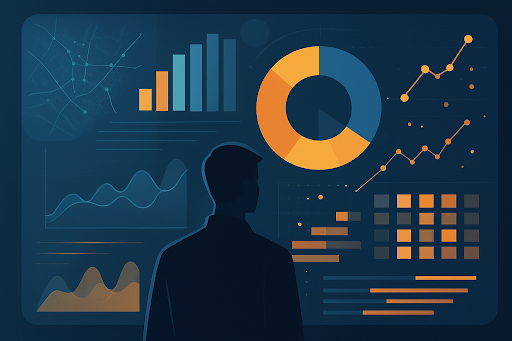
Behind every dashboard, colour gradient, and dynamic graph is a network of data engineers and visualisation experts who transform invisible streams of information into decisions we make every single day.
In my 17 years of teaching engineering and analytics, I’ve watched data evolve from raw tables to living stories. It’s no longer enough to collect data; the real challenge is to see it, understand it, and use it responsibly.
That’s where the new generation of data engineers and analysts come in — professionals trained through specialised programmes such as the Executive Program in Data Visualisation — who shape the unseen patterns that define how our world functions.
The Invisible Design Language of Modern Life
We live in a world powered by data, yet most of it remains invisible. Every tap, scroll, transaction, and interaction generates information. But without intelligent structuring and storytelling, it remains meaningless.
Data engineers and visualisation experts translate these abstract numbers into clarity. They make the invisible visible — turning real-time traffic feeds into navigable maps, transforming economic shifts into dashboards, and converting patient histories into predictive health models.
Modern life, in essence, runs on unseen systems built by people who never appear in the frame — the data engineers.
💡 Reflection: The future will not be built by those who collect data, but by those who can interpret it meaningfully.
The Rise of Visual Thinking in the Data Era
The human brain processes visuals 60,000 times faster than text. That’s why data visualisation has become one of the most powerful languages of the digital age.
From corporate boardrooms to classrooms, decision-makers depend on clear and dynamic data visuals that translate complex systems into insight. But effective visualisation requires both artistic and analytical skills — and that’s what modern data programmes are now cultivating.
The Data visualisation programme for professionals teaches engineers, analysts, and managers how to connect quantitative thinking with design thinking. Learners explore visual storytelling, interactive dashboards, and advanced business intelligence tools that communicate insights to both technical and non-technical audiences.
Current Trends Defining the Data Visualisation Landscape
Today’s data ecosystem is dynamic, immersive, and increasingly intelligent. Here are the five most influential trends shaping how professionals design and interpret data in 2025 and beyond:
🔹 1. Real-Time Data Storytelling
Dashboards are moving beyond static charts. Businesses now demand live, auto-updating
visuals that show performance as it happens.
Engineers use streaming data tools like Apache Kafka and Power BI real-time connectors
to present decisions dynamically for logistics, healthcare, and energy systems.
🔹 2. Augmented Analytics
Artificial intelligence is no longer a buzzword; it’s embedded directly into
analytics.
Augmented systems help users identify patterns, predict trends, and even recommend
actions — blending human intuition with machine precision.
🔹 3. Immersive Visualisation (AR/VR Dashboards)
Data visualisation is now entering three-dimensional and immersive spaces.
Companies are using AR/VR tools to model city planning, environmental simulations, and
industrial design, offering new dimensions of analysis.
🔹 4. Ethical Data Representation
With greater influence comes greater responsibility. Misleading graphs or selective
visualisation can distort the truth.
Ethical design in visualisation ensures accuracy, transparency, and respect for privacy.
🔹 5. Low-Code and No-Code Tools
Tools like Tableau, Power BI, and Google Data Studio have democratised
analytics.
Engineers now focus on logic and creativity, while automation handles the technical
overhead — making data interpretation faster and more accessible.
🚀 Trend Takeaway: The role of the modern data engineer is shifting from “data builder†to “data storyteller.†The ability to communicate insight is now as critical as coding itself.
Why Data Visualisation Is the Heart of Business Intelligence
In the information age, knowledge is power — but visual knowledge is influence. Businesses no longer act on assumptions; they act on visual evidence.
The Executive certification in BI and analytics integrates statistical foundations with cutting-edge dashboard technologies to train professionals in business storytelling. It focuses on three dimensions:
- Analytical Depth – understanding patterns and correlations hidden in large datasets.
- Design Sensibility – choosing colours, layouts, and formats that make insights intuitive.
- Strategic Context – aligning visuals with business goals, not just technical outputs.
This blend of art and logic transforms data professionals into strategic advisors. They no longer report numbers; they narrate stories that move organisations forward.
🧠Mentor’s Note: The best dashboards don’t just display — they decide.
Inside an Advanced Data Visualisation Course
Modern analytics education has shifted from coding-heavy modules to experience-driven learning. An Advanced data visualisation course introduces professionals to real-world tools, simulation-based labs, and design frameworks used by industry leaders.
Core Modules Usually Include:
- Data Modelling and Transformation – How to clean, merge, and prepare complex datasets.
- Interactive Dashboards – Building responsive visuals using Power BI, Tableau, or Qlik.
- Predictive Visualisation – Applying machine learning insights to charts for forecasting.
- Storyboarding and Narrative Design – Crafting a storyline behind the visual.
- Ethics and Aesthetics in Data – Ensuring clarity, fairness, and interpretability.
Learners graduate with practical portfolios demonstrating their ability to design intelligent, decision-oriented dashboards — a core requirement for analytics-driven industries worldwide.
Career Roles That Define the Modern Data Professional
Data visualisation has expanded into a full career ecosystem. The demand spans sectors like finance, healthcare, logistics, education, and entertainment — each requiring engineers who can turn complexity into clarity.
Here are the top emerging job roles in this domain:
🔹 1. Data Visualisation Engineer
Design dashboards and reporting frameworks that support organisational analytics.
Works closely with data scientists and business teams to build actionable visual
systems.
Tools: Tableau, Power BI, D3.js, and Python’s Plotly or Matplotlib.
🔹 2. Business Intelligence Analyst
Interprets business data, detects trends, and advises management on performance
metrics.
Converts raw data into meaningful KPIs and strategic recommendations.
Strong demand in the FMCG, finance, and operations sectors.
🔹 3. Data Storyteller / Analyst
Focuses on presenting findings in narrative formats.
Bridges technical analysis with audience understanding.
Works in marketing, public policy, and media analytics.
🔹 4. Data Engineer
Builds and maintains data pipelines that support visualisation systems.
Integrates sources from databases, APIs, and IoT devices for seamless flow.
Roles increasingly involve automation and cloud-based ETL tools.
🔹 5. Dashboard Designer
Specialises in user experience (UX) and visual communication.
Translates business queries into visual layouts for executives.
A role that blends art direction with analytics knowledge.
🔹 6. BI Consultant
Works with clients to identify their data needs and develop long-term analytics
strategies.
Uses advanced business intelligence frameworks for industry transformation.
📊 Career Insight: Every industry now requires professionals who can interpret and illustrate data. Visualisation is no longer a supporting function — it’s a leadership tool.
The Power of Visual Literacy in Decision-Making
In boardrooms, clarity wins. Decision-makers rely on visual communication not because it’s simpler, but because it’s faster.
A single dashboard can condense weeks of analysis into one glance. A well-crafted graph can expose inefficiency, predict trends, or highlight opportunities invisible in spreadsheets.
Developing visual literacy — the ability to interpret and question what you see — is fast becoming a professional necessity. That’s why the Data visualisation certification now focuses not just on creation, but on critical interpretation. Learners are trained to ask the right questions:
- What story is the data telling?
- What story is it hiding?
- Who benefits from this design?
🎯 Takeaway: In a world full of data, the ability to think visually is the ultimate analytical advantage.
How Data Engineers Shape Everyday Systems
While visualisation gets most of the spotlight, the unseen work of data engineers makes it possible. They are the architects of the pipelines, storage layers, and structures that ensure information is accessible, reliable, and clean.
From real-time flight tracking to smart city monitoring, these engineers design invisible frameworks that underpin daily life. Every time data updates instantly or an app personalises your preferences, a data engineer’s design is at work.
Everyday Applications:
- Urban Planning: Analysing traffic data to optimise infrastructure.
- Healthcare Systems: Visualising patient recovery trends.
- Retail Analytics: Forecasting product demand and supply chains.
- Climate Modelling: Representing environmental data for policy design.
- Education Analytics: Tracking learning outcomes across digital platforms.
🔠Reflection: The true genius of data engineering is that it hides its complexity — letting people experience simplicity without ever seeing the machinery behind it.
Challenges and Ethical Questions in Data Visualisation
As visualisation grows powerful, it also becomes vulnerable to misuse. A simple colour shift or axis change can distort perception. This is why responsible design is becoming a core module in advanced data programmes.
Ethical challenges include:
- Selective omission of data to support biased conclusions.
- Poor scaling that exaggerates or minimises trends.
- Misuse of predictive visuals to manipulate outcomes.
Professionals are now trained to adopt a “truth-first†approach — ensuring every visual is accurate, balanced, and transparent. This is where the engineering conscience meets the data revolution.
Looking Ahead: The Future of Visual-Driven Intelligence
Over the next decade, data visualisation will become as fundamental as literacy. The most successful professionals will be those who can combine engineering precision, analytical reasoning, and storytelling.
Global industries are moving toward autonomous decision-making systems, and data visualisation will form the bridge between machines and human understanding.
🌠Foresight: As automation expands, humans will remain indispensable — not as data processors, but as data interpreters.
✅ Summary Insight:
We live in an age of invisible design. The systems that guide our choices, routes, and
routines all stem from the art of data engineering and visualisation. As more
professionals enter this field through executive and advanced programmes, they’re not
just analysing numbers — they’re designing the language of modern life.